
“Checkout abandonment” by definition is what happens when a customer exits your site during the checkout process, without first completing their order. By this point they’ve found the social proof and reassurance (contact details, returns policy etc) they require to get this far, they’re happy with the product and pricing, and it’s fair to say the majority of customers at this stage will have genuine intent to buy (although not all, as you’ll know if you’ve read my previous posts), far more so than customers who just come on your site and add things to their basket out of browsing habit before buggering off for example.
Yet despite these customers being happy to get to this point, and hopefully having real intent to purchase, your checkout completion rate is highly unlikely to be 100% – so what’s putting these exiting customers off?
Of course, if there’s something fundamentally wrong with your checkout process (massive unseen delivery charges, payment processing faults, ambiguous error messages and so on), then it goes without saying you need to fix those major blockers as soon as possible.
But even if your checkout is running smoothly and it’s properly tested (let’s assume that’s the case as it surely would be for anyone smart enough to read my blog), the reality is some potential customers just need a teeny tiny extra little nudge to complete their purchase.
But how can you give this nudge with minimum effort, and how did one simple addition contribute to a 7.5% reduction in checkout abandonment for me recently on a high growth ecommerce site? Read on to find out…
The coupon code conundrum
My inspiration for this solution really came from years of understanding user behaviour on the checkout, and like all the best ideas, it’s actually a really simple concept.
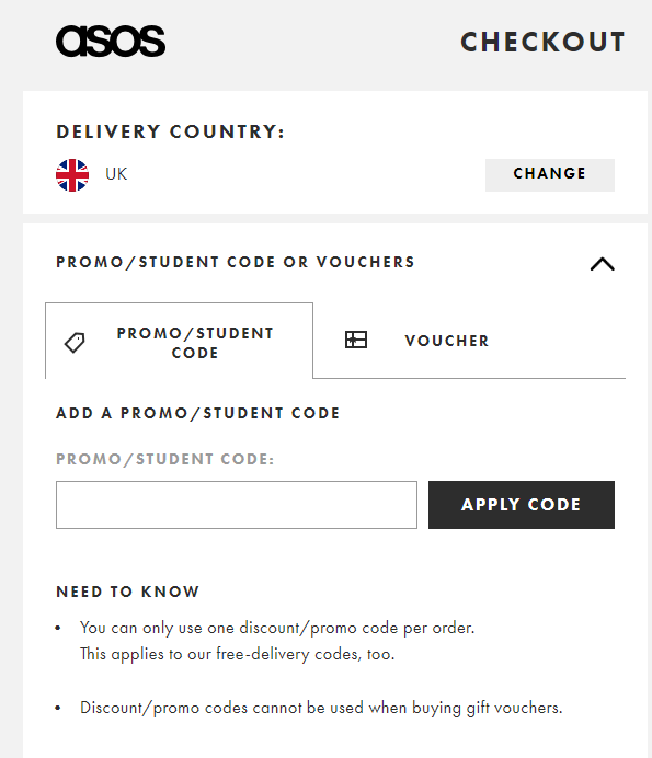
99% of ecommerce checkouts have a discount code box, similar to ASOS below, at the final stage of purchase. You want to show the box at the final checkout stage (and it has to be clear) because if customers miss the option earlier, they’ll get their knickers in a twist about not knowing where to enter their discount code (which they’ve been gleefully holding in their metaphorical palms up until this point), and customer frustration at this crucial stage of the checkout process is something you definitely want to avoid.
So what do a lot of customers do next? Yep, the mouse moves to the top of the window, they open a new tab and they go hunting for a discount code. Even users who already have a code may go on a quest to find a larger discount (and why not); everyone likes a bargain.
And of course, it’s not just discount code hunting that can cause the mouse pointer of your potential customer to wander; maybe they decide to go for a last minute browse for a better deal or perhaps there’s something that’s slightly unclear on your checkout that might cause them to leave the site when really they only needed the aforementioned tiny little nudge to stay and complete their purchase.
Now if a user steps away temporarily and you’re a massive brand with a lot of brand equity, you can be reasonably confident that user will come back to your checkout tab, regardless of what they find. But what if you’re not? What if your number one competitor is deviously bidding on “yourbrandname discount code” in Google Adwords and shoving an unbelievable discount right in the face of that customer who was oh-so-close to buying from you?
What you really need to do, to give yourself the best possible chance of gaining the sale, is absolutely stop that potential customer leaving your site in the first place.
Introducing a behavioural overlay
Now look, when I say behavioural (or exit intent) overlay, you probably think of those horrible exit pop ups on sites that jarringly appear in the middle of the screen screaming “Before you go, PLEASE give us your email address!” as you try and leave a site; believe me, I hate those too. What I’m going to show you how to build below is a heck of a lot more elegant that that I promise.
There are various systems out there that offer this kind of functionality; they can cost several hundred $/£ per month (or more), especially if you want to properly integrate the behavioural overlay with your ecommerce user journey.
But there is a great value alternative; the system I’ve been using for a couple of years now on a number of ecommerce sites is called Getsitecontrol, and with a bit of magic coding fairly dust which I’ll share below, you can achieve the desired end result from just $19 $7 per month.
Creating your checkout overlay
The first thing you need to do is to create an account with Getsitecontrol – it’s a quick and painless process. And because I know you all love a deal, they’ve kindly provided me with a code you can enter during the purchase process; just enter JH2020 for 15% off.
Next, add the small HTML code snippet provided to every page of your website. This can be done in seconds through Google Tag Manager via a Custom HTML tag, but even if you don’t have the facility to add JavaScript code to your site yourself, your developer will be able to do this very easily.
Follow the instructions to set up your site (you can manage multiple sites from one Getsitecontrol account) and you’re good to go. One final little tip, make sure you enable the ‘Integrate with Google Analytics’ option on the Site Settings page; this will fire GA events for every overlay action your users take, very handy for reporting and analysis.
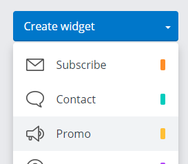
Step 1. Create a Promo
The widget type we need is a Promo; give it a descriptive name as this is what will appear in your Google Analytics Event reports.
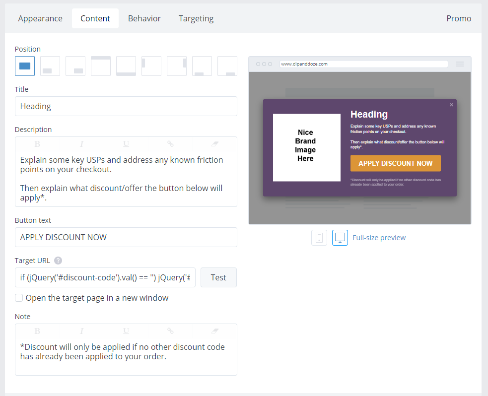
Step 2. Set up your overlay content
Next, you need to set up the content for your overlay as shown below. The styling (image/colours/fonts etc) should match your site branding; you want this overlay to look like it belongs to your site. Next, the content should succinctly promote your order-relevant USPs (e.g. no-risk, free returns), address any known friction points on the checkout page, and finally explain what you’re generously about to give the user when they click that massive unmissable CTA button.
Step 3. The magic button
This is the bit you’re probably looking for (sorry for the wait); the best way to prevent your potential customer leaving the site at this crucial point in the checkout process is to offer that user some instant gratification.
Put simply, it’s exponentially more persuasive to offer a one click discount solution than to make the customer copy and paste a discount code manually; the former makes the customer think they’re getting something worthwhile for virtually no effort (which they are), whereas the latter can psychologically feel like a real chore at the end of the purchasing journey (and not sufficiently less effort than leaving the site to hunt for another code / visit a competitor).
But surely you need an expensive system and some fancy integration to achieve that? Fortunately not, as one very neat feature of Getsitecontrol is that it supports inline JavaScript links for the Target URL, which allows you to implement this functionality with just a smidgen of code wizardry (my development background really does come in handy sometimes).
For Magento 2, the code you need for both the default and Klarna checkout versions is as follows:
javascript:if (jQuery('#discount-code').val() == '') jQuery('#discount-code').val('YOURCODEHERE'); jQuery('#discount-code').change(); jQuery('#discount-form .action.action-apply').click();
For Woocommerce, the code snippet goes like this:
javascript:if (jQuery('#coupon_code').length > 0) jQuery('#coupon_code').val('YOURCODEHERE'); jQuery('#coupon_code').change();jQuery("[name='apply_coupon']").click();
Just change YOURCODEHERE to your desired discount code, slot this link snippet in the ‘Target URL’ section and you’re all set. One little thing to note is that if the user has already applied a discount code, this script (deliberately) won’t override this. You’ll notice in the content overlay screenshot above, there’s a little note that explains this to the user in advance.
For the more technically minded among you, I should point out that as accommodating as the Target URL field is in Getsitecontrol, it doesn’t like curly braces ({}) for some reason, hence why I’ve written the code statement without them. You may also prefer (as I do in reality) to sit the code in its own JavaScript function elsewhere (e.g. in GTM) with the discount code passed as a parameter from the widget, rather than the full script being completely inline in the link. You can then pass different discount codes from different widgets more neatly if you so desire.
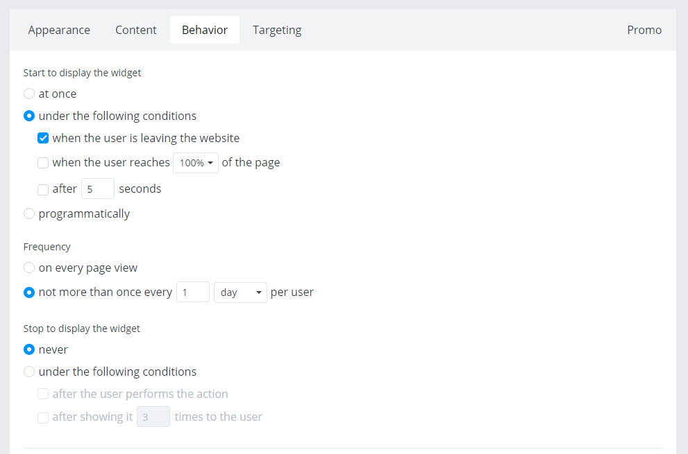
Step 4. Set your Behaviour options
You can play around with the Behaviour options to find what works for your users, but what’s key is you show the overlay as they’re about to leave the checkout page. I’d also suggest not showing it more than once per day to each user, just so you’re limiting the risk of causing annoyance.
Step 5. Set your Targeting options
Again, Getsitecontrol provides a lot of good flexibility here in terms of who to show your checkout exit overlay to. Where possible I’d suggest showing this to every user (who matches the above Behaviour options), but one notable group you may wish to exclude is users who arrive to your site via the affiliate channel (an example of how to do this is on the screenshot below). If you don’t pay out affiliate commission on orders that use a discount code, you may find you have some unhappy affiliates otherwise, although this really depends on a number of factors and the importance of affiliate as a channel to your particular ecommerce site.
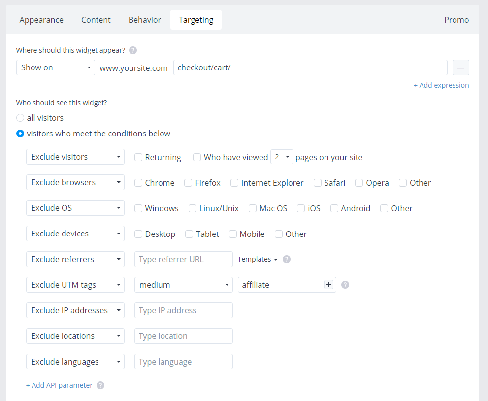
For Magento, the target URL for the standard checkout should be:
checkout/
and for the Klarna checkout it’s:
checkout/klarna/
For Woocommerce, the URL will most likely be:
checkout/
Obviously these URLs may vary if you’re using some kind of bespoke setup, but it’s easy to find and specify the correct URL here.
Save all your settings, and enable your widget on the Getsitecontrol main widget page and that’s it, you’re good to go. Told you it was simple eh?
Step 5. Decide what discount to offer
The final thing to decide is what discount level to offer here. My general rule for this is that you don’t want to offer the same (or heaven forbid a bigger) discount than you might be already rewarding the customer with for putting in some leg work.
For example, if you give your users a 10% discount for signing up to your newsletter (still an absolutely valid and successful tactic by the way), don’t then give them 10% off just for moving their mouse, as the natural user reaction is then “why the hell did I go through the newsletter sign up process when I could have done nothing and got the same discount?”.
What works for me?
Half of the newsletter sign up discount (don’t you just love a straight answer).
On the site I referenced at the start of this post that achieved a great reduction on checkout abandonment following this change, the newsletter sign up discount is 10% and this 1-click checkout exit overlay discount is 5%. It may not sound like a worthwhile discount but believe me, it works at that level.
Of course, results may vary but you can play around with different options easily; Getsitecontrol even supports A/B testing on widgets out of the box. The other thing you might tie to the coupon code if your coupon functionality allows it (i.e. you have a custom coupon code module installed beyond the Magento 2 / Woocommerce default) is a free gift; that can also be a really nice incentive and useful if you have a pile of stock of a particular item to shift.
You said 10 minutes?!
Don’t worry, that’s it! And the 10 minutes is to set the Getsitecontrol system up, not to read the post 🙂
When you’re ready to reduce your checkout abandonment rate, simply head over and create an account with Getsitecontrol and don’t forget to enter the discount code JH2020 for 15% off their standard pricing.
There are many other useful things you can do with the system (it really does offer a lot of useful features) which I may touch on in a future post. And yes, the links to Getsitecontrol in this post are affiliate links (a man’s gotta eat) but genuinely, I’d have written the same post even if they weren’t, it’s a system worth sharing.
As always, this is an idea that’s yielded positive results for me more than once, but although I’d classify it as a fairly low risk strategy, of course it might not work positively for every ecommerce site out there, so caveat emptor and all that and make sure you closely monitoring your checkout performance metrics when making any changes to a live ecommerce site (as I’m sure you do anyway).
Feel free to let me know in the comments below how you get on!
0 Comments